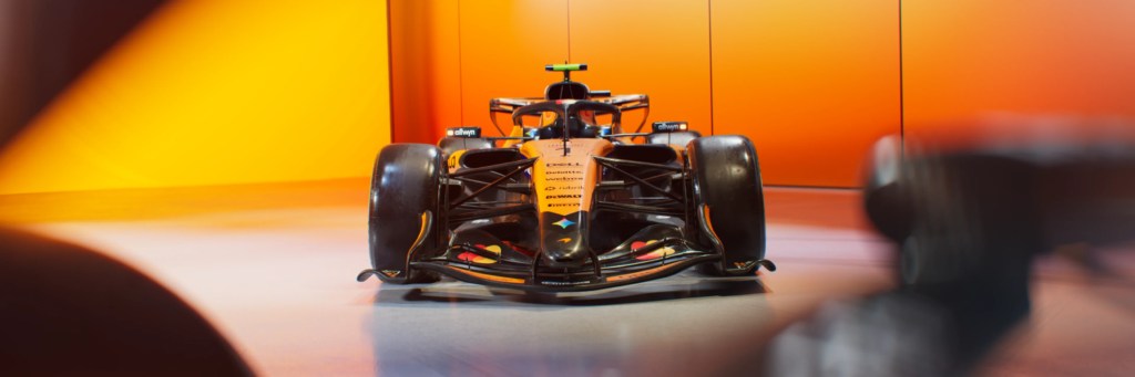
With fashion week kicking off in London, McLaren debuted its first ever fashion show hosted at the McLaren Technology Centre. Twelve original looks were unveiled, made possible by Central Saint Martins students from the University of the Arts London. All twelve looks were designed by forty-six students split into groups and tasked to curate outfits based on six decades of McLaren racing history. Each group was assigned an era, from the 1970s to the 2020s. Interpreting the era and its implication on the look was entirely up to them and allowed for diverse choices of style and technique.
Some might find this campaign ridiculous or disconnected from reality, but fashion and Formula One have never been more intertwined. Race weeks start off with driver arrivals that feel like a fashion show of its own. Fans and media are quick to dissect the drivers’ outfit choices, and most of the grid regularly dominates major fashion magazines like GQ and Esquire. Therefore, this unique concept brings together racing, fashion, and history for a chance to bring racing heritage to life. After months of work, here’s how the collection turned out:
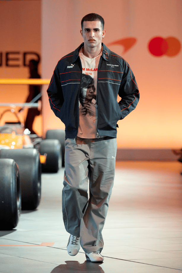
The first two groups designed their looks around the 1970s, a decade that McLaren describes as “a period of rebellion, charisma, and effortless style.” The first group from this Grit and Glamour section of the show focused on that effortless style with a more casual approach. Look 1 starts us off with the very common silhouette from the 1970s: tight on top and loose on bottom. The pants on this model even consist of the slight flare that began the decade. Look 2 honors racing icon James Hunt who raced with McLaren from 1976-1978. I suppose the jacket mimics a racing jacket, but besides the date of 1976 labeled on the jacket and the James Hunt graphic t-shirt, I am not seeing much correlation to the decade. Neither of these looks particularly scream the styles of the decade nor the styles of the racers from that era, but I am interested to hear from the designers to understand their intentions behind the looks.
The second group had two models representing the 1970s Grit and Glamor as well, but they took a different approach. Look 3 appears to have a more typical 70s style. We can immediately see the bell-bottom pants with an added twist of layering at the flare. Another point that stands out to me are the shoes; the model is wearing loafers with a colorful, geometric design. I find the scarf very intriguing as it is woven together in a peculiar way, perhaps with a meaning of innovation and design. Look 4 is another unique design involving lots of geometric shape. Geometrics and stripes were a major motif of the 1970s, having continued from 1960s fashion.
The next two groups worked on designs regarding the 1980s, a decade labeled Precision and Power. Looks 5 and 6 had a simple elegance to them that convey a calm sense of power from whomever wears them. The 80s saw a rise to the functional approach of fashion, and these two looks show just that. I also enjoy the subtle touch from Look 6 of the leg warmers to represent the fitness fashion of the 80s. The next two looks give reference to the more extreme fashion details of the decade. Look 7 also has the subtle fitness fashion approach with the appearance of legwarmers. However, it also introduces the multilayering of a skirt with what almost pays tribute to the power suit with the wide shoulder jacket on top. Look 8 is interesting to me because it screams the neon colors and the bulky top layer of the decade, but I am unsure what else it is trying to portray. Once again, I would love to hear the perspective of the designers to better understand the depth and meaning behind these two pieces.
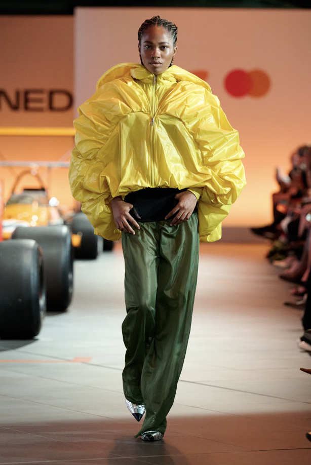
Global Icon is the phrase used to represent the decade of the next two groups: the 1990s. Look 9 jumps into the interpretation of classical themes used in men’s 90s fashion. Early 1990s fashion focused on minimalism, and this look does exactly that without appearing too boring. It conveys an effortless aura often protruded from Formula One drivers of the era. Look 10 gives a similar element of effortlessness but from a women’s aesthetic. The 1990s moved away from the idea of a singular style, so I think these two looks did a good job of encompassing the decade’s energy. Looks 11 and 12 are when we start to see an intriguing level of uniqueness brought into the designs. These two designs do not seem to reference a particular style of the 90s as much as they reference the brand itself. It also seems to have reference to a futuristic style of fashion with the bright colors and bold silhouettes. I enjoy these two looks a lot.
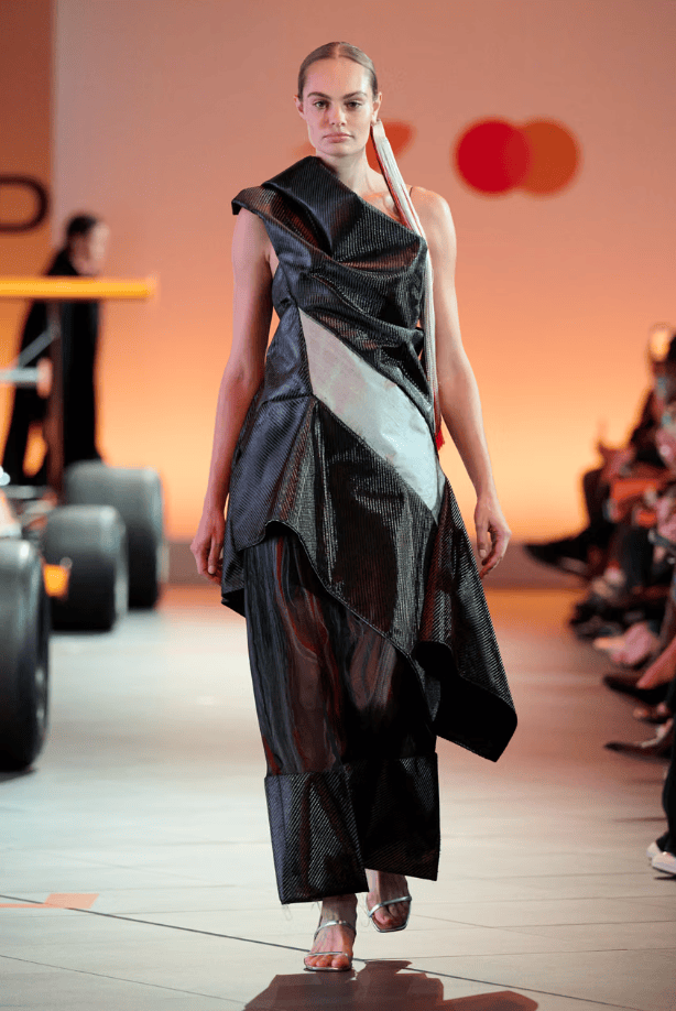
Engineered Athlete is the title of the next grouping, set between the 2000s and 2010s. Looks 13 and 14 have fairly identical designs with minor separations between what seems like gendered elements. I found these two looks kind of bland and boring, but they did represent the fashion of many drivers’ casual paddock looks. Look 15 is interesting because it has the modern styles of clothing, but the fabric is particular in such a way that it must represent something relating to racing. It almost appears similar to the designs of regular car tires, but the long tassel hanging on the side of the model is making me wonder what the complete intended expression of the design is meant to be. Look 16 does not feel inherently related to racing, but I think the bulkiness and power of the outfit draws from the concept of new-age athletes and their media presence.
The last four groups worked on the 2020s Papaya Era. This decade is shaped by a heavy use of social media and a new era to the fanbase. Look 17 has this awesome metallic look coming off the jacket and trousers with what appears to be a car exhaust pipe design wrapping around the neck through the jacket. Look 18 includes a knit top with dozens of McLaren Formula One cars wrapping around in a pattern. The orange trousers are parachute pants, and overall the silhouette of this look screams 2020s. Look 19 has a lot going on within it, but what stands out the most to me are the strips of fabric trailing behind. What immediately comes to mind looking at this is the aerodynamic lines coming from a racing car. I am not sure if this is the intended message from this look, but I love the idea. Look 20 is particularly outstanding because it used the look of a car seat in its design, turning it into a cape, which brings in the element of aerodynamics as well.
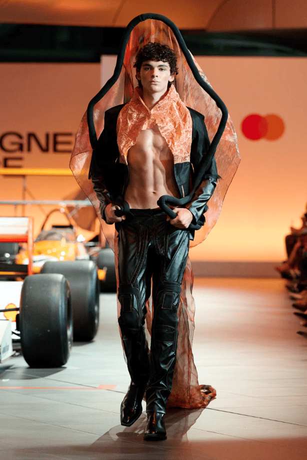
All of these looks were very creative and distinctive, using fashion to explore the heritage of McLaren Formula One. I am sure there is so much more meaning to each of these looks that I missed due to only viewing them through a screen and being unable to speak directly to the artists themselves. However, from what I did see, I think they represent the history of McLaren exceptionally well.
Images and clips of the collection can be found on McLaren’s social media pages and the full fashion show footage can be found on McLaren’s Racing Club website.


Leave a Reply